Heatmap
Contents
Definition
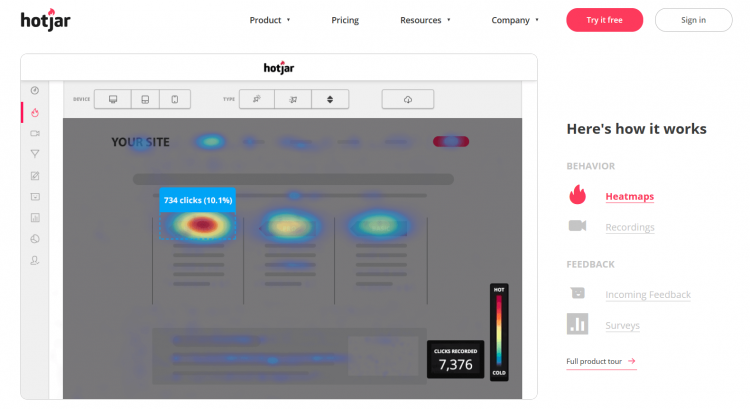
A heatmap is a method of color-coded data visualization. It works by using color to denote the respective magnitude of a particular trend within different areas of the image.
Heatmaps can be used in a variety of different ways, including photographing temperature or to illustrate tracking techniques, in order to inform a process of web analytics.
This technique is designed to make immediately clear to a viewer the trends and complicated information that have been gathered by collecting this data. This is especially useful when attempting to summarise trends present in a vast amount of gathered data. For example, in the case of web analytics, heat maps can be used to show how often users engaged with different areas of a web page.
The typical coloration of a heat map uses a temperature based pallette, ranging from white and red to blues and blacks, where areas at the colder end of the color spectrum (so colored blue and black) have a smaller magnitude of the measured trend than those at the warmer end (which are colored white and red).
Heat maps can either take the form of spatial heat maps (which use cells to color the image) or cluster heat maps (which feature an apparently seamless transition between colors).
How to create a heatmap
In order to create a heatmap, you will need to use a specialist tool. Online, you can find heat map generation software which can collect the required data from visitors using your web page. Once it has collected this data, it will then display it on a heat map for you to then assess.
You can opt for a number of different types of heatmaps, each of which provides you with a visualization of a specific metric. These types include:
- Click maps
- Mouse tracking heatmaps
- Scrollmaps
- Desktop heatmaps
- Mobile heat maps
The key to creating a useful heatmap lies in carefully outlining the goals that you want to achieve from this process.
When creating a heatmap, identify the specific web page that you would like to analyze. Also consider what you want to achieve from this process. For example, you may be surprised by the lack of popularity that your recent email marketing campaigns had amongst visitors, so you intend to use heat mapping to understand this trend, then make the necessary changes required to increase the number of users signing up for your company’s email newsletter.
You could also use A/B testing to make modifications to your website, based on the areas of strength and weakness that the heatmap has identified. Then you can gauge the success of this amendment, and repeat the process until you achieve the desired result for the web page.
For the best results, choose the heatmap and the data collection method which best fits this specific goal.
The other key point to consider when creating a heatmap is that you ensure that you have a sizable group of individuals for the testing process. The heatmap must include data from a large sample size, in order to successfully illustrate a representative average of your site’s users.

A screenshot of the heatmap software Hotjar
What can a heatmap be used for?
It is important to note that, since heat mapping is a method of collecting and displaying quantitative data, it is limited to showing trends. It does not break down the reasons why this trend has occurred - it is up to the web developer to assess the meaning of these results.
Heatmaps can be used by web developers to better understand the behaviour of their site users, and how a visitor typically interacts with a web page. In doing so, this display of data can be used to make intuitive improvements to the UX of a web page.
The following website metrics can be displayed on a heatmap:
- Mouse clicking
- Eye tracking
- Scrolling
Each of these metrics enable web developers to optimize a web page. It is a particularly useful way of displaying data if you are planning on a website redesign, or undertaking a process of mobile optimization.
Heat map analysis can be used to evolve a website’s user interface in a way which enhances the usability of a platform, in direct response to the mindset of visitors. In addition, through this knowledge, heat maps can be used to ensure that important content is seen by the company’s audience.
Importance for Online Marketing
The use of a color scale in this tool allows marketers to directly compare the popularity of different elements on a web page, and so identify why an element is not drawing the attention of the viewer. This process also necessitates a consideration of why this is the case - for example, a link might not be labelled clearly enough, or a banner might not be colorful enough to entice the viewer.
Heatmaps can be used to gain a more detailed insight into user behaviour than other methods of analytics. This is because it provides a highly personable breakdown of a typical user journey, and an understanding of the factors which bring about certain trends, such as a high bounce rate.
As such, heat maps can be used to enhance your understanding of various metrics, or to improve the success of marketing strategies such as email campaigns, landing pages, specific website features, CTAs, and so on.
Furthermore, heat mapping is a very accessible method of data visualization, which is especially useful for any marketers who do not have experience in analyzing complex data.
Related links
- https://blog.hubspot.com/agency/12-ways-to-improve-user-experience
- https://moz.com/ugc/google-analytics-heat-map-analytics-good-designer-sexy-conversions
- https://developers.google.com/search/blog/2020/05/evaluating-page-experience?hl=en
Similar articles
| About the author |
 |