Call to Action (CTA)
Contents
Definition
A call to action (often abbreviated to CTA) is a marketing term that describes a short sentence used to prompt the audience to act. CTAs are written to be compelling and to move the reader to take the next step in the form of a specific action. This action varies depending on the marketer’s goals, but it is usually linked to a conversion strategy.
CTAs can be used in traditional advertising mediums, such as printed ads, TV, and radio advertising. In online marketing, CTAs are commonly placed at the end of a website page, on a landing page, or after strategic blocks of content. When used in digital marketing, they are usually enclosed within a button to grab the reader’s attention and stand out from the rest of the text. However, online CTAs can also appear in-line, as pop-ups, slide-in banners, or using social sharing links.
Goals of the call to action
The main goal of a call to action is to generate conversions. But the CTA can have other goals, which often complement or lead up to a conversion. Some of those goals include generating awareness about a brand, product, or service; generating leads; building an email list that can then be used for email marketing campaigns, or growing your follower list on social media platforms.
Possible applications
Some of the most common applications in digital marketing include placement in social media platforms (like a subscribe button in a YouTube video), blogs, e-commerce sites, and business websites. Irrespective of the medium, calls to action are used to get the attention of prospective customers. There are different types of CTAs that target the different stages of the conversion funnel.
For example, a call to action placed on a home page can generate awareness by prompting the reader to explore other parts of the site and making potential customers aware of certain products and services. In a monetized blog, this technique can be used to spark interest and move the reader to subscribe or sign up for updates. When a potential customer is at the desire stage of the conversion funnel, the right call to action will get them to act on that desire. For example, they may be prompted to get a free trial for a software product or to add a product to a wishlist or cart in an e-commerce site.
Another potential application is generating loyalty. For instance, an e-commerce company may send an email campaign and place a CTA like “Redeem your discount voucher” next to a coupon code.
A call to action can also be used to build social proof by encouraging customers to leave reviews or testimonials.
Other possible uses include prompts to visit a store, attend an event, book a hotel room, etc.
Success Factors
One of the most important factors for a good CTA involves the use of clear and direct language. For a call to action to be effective, the reader has to see the next step as something logical and natural. A good CTA rounds off everything the prospect has learned about a company, product, or service, and moves them to act on their interest and desire.
Moreover, an effective call to action must be perfectly integrated with previous content. Any copy written before the call to action has to gradually lead to the next step.
When expertly designed and used, CTAs can deliver a high return on investment. To achieve this, some of the key success factors include:
- Optimal placement: The main principle is to place the call to action after the offering has been explained in detail so that the reader is ready to commit. In some cases (such as when offering a free product or service) this may be above the fold; in others, it will be at the end of the page or email.
- Phrasing: Calls to action are usually written as imperatives (e.g. “Get your free trial” or “Buy now”). However, those written in first person (like “I want a free demo” or “Send me my e-book”) can get higher conversion rates, since they address the reader directly and draw them into the desired action.
- Specificity: Generic CTAs like “Click here” or “Submit” are rarely compelling enough. For better success rates, ensure the language used is specific to the conversion goal. For instance, instead of “Submit”, you could use “I want my free quote”.
- Button design: If a call to action is placed within a button (as opposed to inline), keep the wording concise and make good use of white space. Other good practices include using contrasting colors and ensuring there are no other graphics nearby that compete for the reader’s attention.
- Artificial scarcity: Ensure the language you use creates a sense of urgency. Fear of missing out is effective in moving people to action and can increase conversions as long as the offering is relevant.
- Spell out the benefits: Calls to action like “Get your free report on how to double your income” give your prospect one more reason to take action and can help eliminate any doubts they may have.
Example of a well-designed call to action
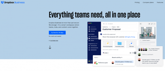
A good example of a CTA can be found at dropbox.com.
Screenshot showing a call to action of dropbox.com
The lead-in makes potential customers curious about the product and creates awareness while the following paragraph explains what the software can do for you. Additionally, the call to action is the only button and is placed and colored in a way that makes it clearly visible.
