Above the Fold
Contents
Definition
Above the fold is the area of a website which captures the immediate attention of visitors. It is the first thing that users will see upon visiting a site. The area of the site that is classed as above the fold is the first part of a webpage which users will get when they are directed to that page.
The term above the fold is also commonly applied to content that has been published in newspapers, too. In fact, the term arose as a result of printed media, as it was applied to the information that was selected to be printed at the front of the newspaper, where the reader’s eye would be naturally drawn to.
From a layout perspective, it was particularly important to consider the fact that the newspaper would be folded in half on the display. As a result, only the top half of the front page would be initially visible to prospective customers.
It was imperative that the headlines and the snippet of information that would be seen first were attention-grabbing enough to convince the reader to purchase the paper and read on. As a result, the types of content that would be included above the fold were typically bold headings, intriguing taglines, images, and engaging text. Over time, this principle came to be applied to digital forms of media, too.
For websites, the web page content which can be described as above the fold is anything that is visible before the user scrolls down the web page. This includes any banners, headings, or menus that feature on the site, and this often includes the opening sentences of written text that are included on the page. Any content that needs to be scrolled to be seen is classed as below the fold.
What content should be positioned above the fold?
It is important for web designers to consider their web page positioning, and utilize the concept of above the fold in order to create the best possible initial impression of the brand amongst visitors to the website. The better the content above the fold, the more it can increase the website’s conversion rates, generate more traffic and gain higher numbers of sales.
So, you should position engaging, vibrant, and appealing content, which is both attractive and easy to understand immediately.
For example, the type of content that would be beneficial to position above the fold includes:
- Visual headers
- Punchy headlines or taglines
- Colours
- On-brand visuals
- Company logo
- Images
- Photographs
- Videos
- GIFs
- Short, entertaining and well-written copy, or cliff-hanger text
- A clip that briefly outlines the company’s services
- An interactive slideshow
- Customer reviews and testimonials
- A call to action, either via copy, a hyperlink, a sign-up page (for example, to an email newsletter), or a button
- A selection of the best selling products

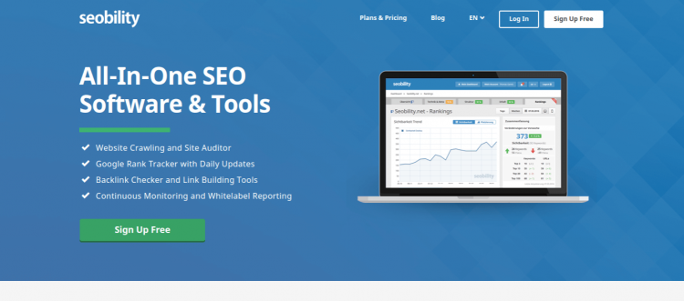
The above the fold content of seobility.net
Best practices for using above the fold to design your site
Beyond the example that we outlined above, if you are looking to redesign your website’s above the fold content, it is important that you consider the following factors:
- Not all screens share the same dimensions, so ensure that your above-the-fold content has the same impact for a customer that is visiting your site via a laptop, as it would have for someone accessing the site through their mobile phone.
- Use this as an opportunity to be creative with your site’s online marketing strategy. Avoid using standard, commonplace website templates for your above-the-fold content, as this is unlikely to either stand out in the market or excite the viewer.
- Use a clean, simple design. Don’t attempt to cram a lot of information, noise, or busy imagery into your above-the-fold content, which could confuse or deter the user.
- When creating this web content, you should work to incorporate User Interface and User Experience best practices.
- Consider using A/B Testing as a method of identifying which content design works best for your users.
Importance for Online Marketing
There is some debate amongst marketers and web design specialists as to whether or not considering what is and is not above the fold remains to be relevant. This is because scrolling is becoming second nature to many web users, which places less emphasis on the need to locate important content above the fold.
However, in terms of web traffic analysis, it certainly makes sense to consider your web page structure in this way.
This is because it has been estimated that an average visitor to a webpage will spend 80% of their visit looking at content that is above the fold. A study conducted in 2015 indicates that CTR is not a Google ranking factor.[1]
If your website or marketing metrics are informing you of a negative trend (such as a high bounce rate) then you can use the concept of above the fold to improve these statistics.
For web designers, considering what content to locate above the fold is an important part of company marketing, as it may determine whether or not a visitor remains on the website. The content located here should make it clear what the company does, attract the target market, and represent the brand values.
As such, using the concept of above the fold can ensure a more successful promotion of your company site to visiting customers. This is because optimizing your content in this way means customers are more likely to engage with your web page and continue using this site to make a purchase.
Alternatively, you may wish to use a parallax effect on your website. This is where a highly visual three-dimensional scrolling effect is created, thereby advantageously using the above-the-fold concept to create a more memorable and engaging site.
References
- ↑ Scrolling Attention Use It. Retrieved 15 January 2021.
Related links
- https://blog.hubspot.com/customers/bid/109640/place-your-landing-page-content-above-the-fold-google-tool
- https://www.searchenginejournal.com/minimalist-web-design/361934/