One Pager
Contents
Definition
One-pagers are websites that consist of only one page and do not contain subpages, categories or anything similar. By concentrating on the essentials, users’ attention is directed to specific content and information, which offers significant opportunities especially in the area of online marketing.
Structure and functionality of a one-pager

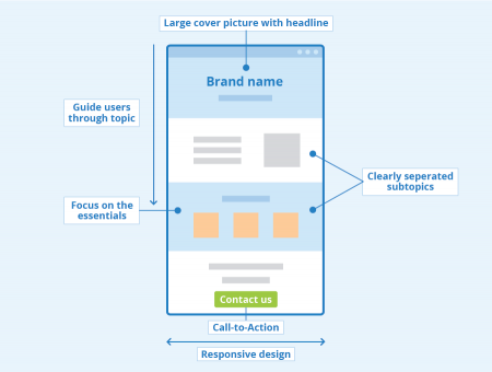
Most one pagers make generous use of graphic elements in web design. Usually, users are greeted by a large cover picture with a short text resembling a headline. More information is available by scrolling through the page. Different subtopics are clearly separated from each other by design and tell a story to users. This functionality also proves to be very user-friendly on mobile devices, as users do not have to fight their way through complicated menus and can reach their goal effortlessly. At the end of the one-pager, a call to action is often used. This can be an invitation to make contact or to purchase the presented product.
Creating a one-pager
There are no fixed rules for creating a one-pager but there are some guidelines you can follow. The most important thing is to concentrate on the essentials and avoid unnecessary information. Users can find out about certain details of a project elsewhere. On this particular page, the focus is on guiding users through a specific topic. The principle is very similar to the character of a sales talk. Avoid making this page too long or placing too much information on it. Most users are not very fond of scrolling through a website for a long time. In addition, long loading times or jerky picture sequences are also a factor that can prevent the success of one-pagers. Here, too, it is important to focus and use this type of website for a certain topic only.
For easy orientation, it is a good idea to integrate fixed navigation bars into the design. This gives users security and reduces the chance that they leave your website early. For example, you could use navigation elements with which users can jump directly to specific subtopics.
A call-to-action at the end of a one-pager is characteristic and elementary for this kind of web design. Due to their specificity, one-pagers usually achieve significantly higher conversion rates than classic websites.
Finally, it is essential to pay attention to responsive design. You have to make sure that visitors automatically receive an adapted version of your website both on mobile devices and on a computer for the concept to work out.
Possible applications
One page web design is used in marketing to present very specific issues. Examples are individual products or events as well as projects. By concentrating on the essentials, the aim is to increase the amount of time visitors spend on your site and help them memorize the presented content better. One-pagers are therefore a popular instrument for promoting online campaigns. This kind of website is very focused and has a specific purpose. The design consciously stands out from classic websites and tries to emotionally appeal to users.
Search engine optimization of one-pagers
Despite the limited content, there are several possibilities for the search engine optimization of a one-pager. The most important thing is to have a central keyword that spans the entire website. In most cases, this is the name of the product, project, etc. presented. In the past, so-called hash URLs have also proven to be helpful. These are links that lead to a specific area of the one-pager. Users who are looking for a specific detail can reach their goal this way. In addition, search engines can display a particular subtopic of your one-pager in the search results for corresponding search queries.
Advantages and disadvantages
When used correctly, the reduction of websites to a single page results in various advantages. For example, users tend to view the entire content and do not overlook any important information during their visit. Visitors are also guided through a topic by the special web design and the creator has control over how users perceive his content. Due to the high clarity, the reading flow is not disturbed and there is no danger that users suddenly jump to another topic. Last but not least, the implementation of a one-pager is usually faster and easier than with complex websites with subareas, menus, and categories. Thus, advertisers can react very quickly as, depending on the topic, creation is possible in just a few days.
One of the disadvantages is that some visitors might be irritated by this kind of web design. Although one-pagers are deliberately kept simple, some users might miss common navigation elements and feel confused. In addition, the lack of subpages makes search engine optimization more difficult. Even with a high level of commitment, you will never be able to compensate this completely. With regard to ranking, one-pagers almost always fall behind complex websites. Also, the high amount of multimedia content can lead to long loading times and bad user experience, especially on less powerful devices. Due to these disadvantages, one-pagers are in most cases only a supplement, but can never completely replace classic websites. To present an entire company, business or product portfolio, a classic website still is the right choice. On the other hand, the presentation of individual products, services or projects on a dedicated website can be a central element of a marketing campaign.
The advantages and disadvantages of one-pagers in summary:
| Advantages | Disadvantages |
|---|---|
| users are more likely to read the whole content | lacking navigation elements can irritate users |
| control over how users perceive your content | more difficult search engine optimization |
| high clarity | possibly longer loading times |
| users don't jump off to another topic | not suitable to present complex issues |
| faster and easier to create than classic websites |
Example of a good one pager
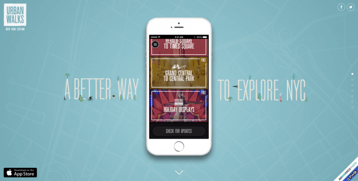
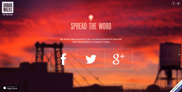
An example of a good one pager can be found on the former website of "Urban Walks", an app that offered discovery tours in New York City. On this one-pager, the app is presented in a creative and appealing way and users are led to the final call-to-action, where they can register for the newsletter, share the site on social media, and download the app.

Screenshot of former website urban-walks.com

Screenshot with a call to action on the former website of urban-walks.com
Related links
Related articles
| About the author |
 |