Mobile First
Contents
What does mobile first mean?
Mobile first means prioritizing the development/design of a piece of software or a website for mobile phones rather than for desktop or other viewing possibilities. In SEO, it refers to search engines using algorithms that prioritize the mobile version of a site over its desktop version, potentially ranking pages that aren’t optimized for mobile lower than those that are optimized for mobile users.
How the internet is impacted by mobile phones
As mobile phones became more widespread and internet connectivity was improved, more and more people started searching online using their phones. Mobile searches on popular search engines are said to account for over 50% of searches since mid-2016 according to Statcounter [1].
With more people visiting websites on mobile phones, a shift was needed towards mobile first web design to ensure websites were functional on the smaller screen sizes and slower loading speeds available to phone users. Since it’s a search engine’s goal to provide the best search results for its users, a website’s mobile usability became ever more important as smartphone adoption grew. This ultimately led to them focusing on mobile webpages for indexing and ranking sites.
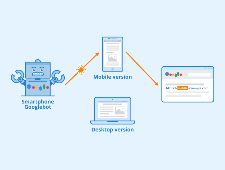
Mobile-first indexing
Mobile-first indexing was fully rolled out by Google in July of 2019, according to their website [2]. Since then, Google focuses predominantly on the mobile version of webpages for indexing and ranking, taking only the content that’s visible on the mobile site into account.
Google also implemented a crawler that simulates a mobile visitor, further emphasizing the importance of creating websites with a mobile user in mind. The reason Google gives for this on their site is that the majority of Google’s users perform searches on their phone as opposed to on a desktop or tablet.
Mobile first web design
The large number of users visiting sites on their mobile phones led many web designers to focus on responsive web design. This means that the website should function well on all screen sizes. Although web design and content creation focusing on mobile users wasn’t new at the time, Google moving to mobile-first crawling greatly influenced that pace of adoption.

A rendering of our site on ready.mobi which shows the different ways our site is displayed on different screen sizes.
Optimizing your website for mobile
Certain things are considered important to optimizing your website for mobile. Some of these are:
Responsive web design that is optimized for mobile
Ensuring your website is responsive and works well on all screen sizes is important for mobile usability. This also includes ensuring that content can be read easily, and buttons are easy to click on handheld devices.
Web page weight and load time
Ensuring images are compressed and the website loads quickly on mobile phones is important for performing well in mobile search. Since many phone users have access to slower internet speeds, this is even more important than for desktop searches, although this may change with the introduction of 5G.
Using structured data & competing for rich snippets
Rich results are being used more widely across Google SERPs and optimizing your content for them using structured data can be an easy way of appearing in rich snippets and other rich results. Since many mobile searches are questions or local search queries, it’s even more important.
The implications for SEO
Mobile first had a huge impact on SEO and web design, especially considering Google used desktop versions of web pages to index and rank results before it was introduced. Since Google moved to a mobile-first focus, so has SEO. This has led to different best practices, as well as prioritizing certain tasks that help optimize a site for mobile.
Examples of how SEO has changed include:
- An increased focus on page speed
- More focus on responsive design & overall mobile-optimized design
- More focus on optimizing for rich results.
The way content was optimized also changed, as content writers started optimizing their content for readers on phones. Although other factors also influenced the changing SEO focus, mobile-first indexing is considered one of the driving forces behind it.
References
- ↑ Desktop vs Mobile vs Tablet Market Share Worldwide Statcounter. Retrieved 09 January 2021.
- ↑ Mobile-first indexing best practices Google Search Central. Retrieved 09 January 2021.
Related links
- https://developers.google.com/search/mobile-sites/mobile-first-indexing
- https://www.searchenginejournal.com/technical-seo/mobile-first-index/
Similar articles
| About the author |
 |