Responsive Web Design
The number of people who use their smartphone for surfing the internet has increased steadily in recent years. This trend of mobile internet use has a direct influence on how web developers program their web applications and websites. Responsive web design is the result of trying to optimize modern websites and web apps for display on mobile devices.
Contents
What is responsive web design?
Responsive web design is a creative and technical paradigm for creating web apps and websites. The same HTML code is sent to all devices, but all elements of the website, such as textual and audio-visual content, automatically adapt to the size and width of the display used. When using responsive web design, large images, which can easily be displayed on a 27-inch monitor, may not be displayed on a smartphone because they would take up too much space and the page would be of no value to users. This is important because smartphone users primarily visit a website to retrieve information (e.g. opening hours, addresses, etc.). Mobile websites should, therefore, make it easy for users to find the information they need quickly and not be distracted by too many graphic elements.
Responsive web design is based on a complex interaction of different technologies. The use of modern web standards such as HTML, CSS (especially media queries) and JavaScript enables developing websites that automatically adapt to the respective device. The main advantage of responsive web design is that content on a website no longer has to be optimized for each possible device separately. In addition, a responsive website offers a much better user experience and usability than traditional mobile websites.
Why is responsive web design so important today?
The number of mobile devices is constantly increasing and so is the number of internet users surfing the web via such devices. Before responsive web design became popular, there were often two versions of a website, one for desktop and one for mobile devices. However, with the launch of the Apple iPad, a new screen size was introduced to the market and it quickly became clear that this concept had no future in the long run. To avoid that a new website has to be created for each new device type, responsive web design was developed. Responsive web design made it possible to offer the best user experience on different devices with only one website.
How it works
A page equipped with responsive web design takes into account the individual requirements of different devices. Websites are adapted in such a way that they are displayed to every user as clear and easy to use as possible.
Important criteria for the adapted display are the size and resolution of the device as well as available input methods.
In particular, HTML block elements must be treated differently in responsive web design. If the design grid occupies several columns, the block elements can be individually adapted to the width of the respective viewport. In the context of web design, a viewport defines the area of a page that is visible on mobile devices. If it is no longer possible to display block elements next to each other at lower resolutions, they are simply moved one below the other or positioned individually (see figure below).
Images are scaled to the size of their surrounding elements, textures for backgrounds can be omitted, and logos can be reduced in size like images or replaced by smaller versions. Horizontal navigation bars, which are often used for desktop display, can be redesigned as a vertical list and only be unfolded after being clicked.
Technical implementation
The three essential prerequisites for the technical implementation of responsive web design are:
- CSS media queries
- meta viewport (HTML)
- a thoughtful CSS concept
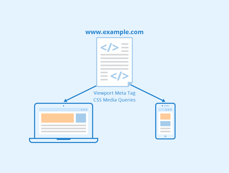
Media queries are an important part of CSS that enable the correct display of a page on different screen sizes and resolutions. Media queries are used to determine and define individual layouts for different device types. It is not absolutely necessary to specify the correct screen size for each device via media queries. Rather, so-called breakpoints can be set for different display resolutions. When a page is loaded, smartphones then receive the correct layout via media queries, which optimally adapts the page to the display size of the respective device.
Besides media queries, the HTML meta element viewport also plays an important role in responsive web design. This meta element ensures that the content of a website is displayed completely and clearly. This is done by optimizing the length and width of the website so that it can be displayed adequately by mobile web browsers.
Importance for SEO
Responsive web design has become very important for search engine optimization (SEO). Since April 21, 2015, websites optimized for display on mobile devices have been given preferential treatment by the Google algorithm and have been rewarded with a better ranking in search results. Other SEO tactics such as link building are also much easier with a responsive page since in this case the link building only has to be done for a single website instead of one mobile and one desktop version.
The advantages of responsive web design are as follows:
- it’s possible to optimize for any device
- better user experience and usability
- consistent user experience and long-term user loyalty
- reduced maintenance and administration costs
- the same HTML code can be used for all devices
Related links
- https://developers.google.com/search/mobile-sites/mobile-seo/responsive-design?hl=en
- https://www.invisionapp.com/inside-design/examples-responsive-web-design/
Similar articles
| About the author |
 |