Viewport
Contents
Definition
The term viewport refers to the size of a window or visible area on a screen. In general, this term is used for displays on mobile devices such as smartphones and tablets.
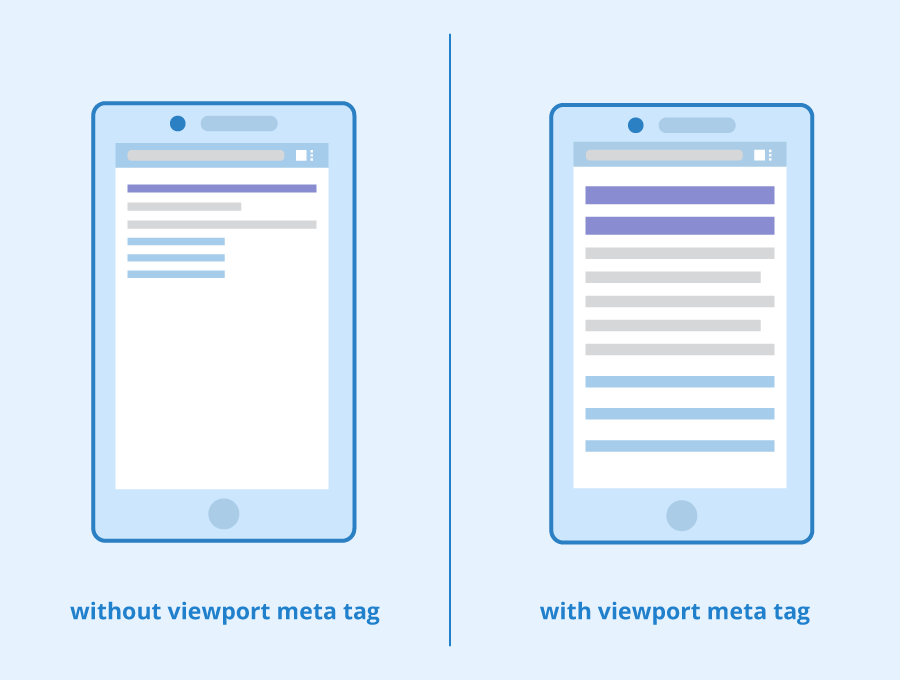
A more specific meaning of the term viewport refers to a meta element in HTML 5, which plays a crucial role in mobile optimization. The element scales the displayed content so that the size of the screen can be used efficiently. In this case, the meta element viewport ensures that all content is equally legible and displayed correctly and completely on screens of different sizes. The viewport element adapts web pages to the screen’s length and width so that mobile browsers can display the entire content correctly.
General information about viewports
Thanks to the viewport, websites on mobile devices are not displayed in the same way as on a desktop screen. Users do not have to zoom in but can view the content of a page in a way that matches the small display. Viewports as meta elements (in combination with responsive web design) help web browsers to break up the pages and reassemble them on small screens in a way that enables users to receive a meaningful and readable image. Viewports thus have the task of preventing display problems by determining output formats that are tailored to the respective mobile device.
Functionality of the viewport in HTML code or in a CSS file
You can integrate viewports in your HTML files in two different ways: either directly in the document or in a referenced CSS file, whereby the syntax of these two alternatives only slightly differs.
If you want to include the viewport directly into your HTML file as a meta tag, you can use the following code:
<meta name=viewport content="width=device-width, initial-scale=1">
In this case, the width is defined so that it adapts to the respective device’s screen width (width=device-width). Initial-scale stands for the initial zoom factor and signals that your page is to be displayed 1:1 on the screen of a mobile device.
You can also use a viewport to define the height and configure a minimum and/or maximum zoom factor. In addition, the meta tag can prevent users from being able to zoom (user-scalable=no), which is especially useful for apps.
If you specify the viewport in a CSS file instead, you should put it right at the beginning of the file to ensure a correct display. Here's an example of how that code could look like:
@viewport {
width: device-width;
}
Possible difficulties
The main difficulty with viewports is that there is a growing number of mobile devices with different dimensions. However, in order to achieve an optimal display on all available devices, there are various tools and software to check the correct display on standard mobile devices. Such tools, for example, are the iOS MIH-Tool, Ghostlab and Adobe Edge Inspect. The latter is also available for Windows. In addition to these test tools, we recommend you to perform real tests on your own smartphone.

An example of the Seobility homepage on a display the size of the Samsung Galaxy S8+ viewed using Chrome DevTools
Another difficulty is the pixel density. After all, it is not the size of the display, but rather the depth of the pixel display that is decisive for the display on mobile devices. Although pixels are constant units, mobile devices often have a greater density of pixels than older computers. For this reason, it is important for developers to consider how much content should be displayed on a display and whether scaling makes sense.
Practical relevance
Viewports should be specified either in HTML code or in a CSS file for all websites to ensure that they can be displayed on mobile devices appropriately. Especially in the context of responsive web design, a viewport is indispensable and has become the standard for mobile optimization. All website operators who want to provide their users with pleasant and undisturbed reading and surfing experiences should address this topic since the number of mobile users is continuously increasing.
Relevance to SEO
With the shift towards mobile-first indexing, where search engines crawl and index sites based on their mobile version, viewports are an important part of modern SEO. A well-configured viewport is essential in enhancing the user experience (UX) on mobile devices. Websites that offer superior usability are favored by search engines, which can lead to improved search rankings. This is because a positive user experience, facilitated by a responsive viewport, ensures that content is easily readable and navigable across a range of devices, particularly on smartphones and tablets.
An improved user experience also has indirect SEO benefits. One of these indirect benefits is that people prefer to link to websites with a good user experience, helping you attain more backlinks to your site. When a website isn’t optimized for mobile or has a bad user experience, it’s unlikely that other sites will want to link to it. This is also the case with social shares, which can also have an indirect impact on your SEO and overall marketing efforts.
This improved usability can help to improve user signals too, which may be taken into account by search engines when determining search rankings. All-in-all, optimizing the viewport and general design of your website can have a positive impact on your SEO and marketing performance.
In summary: Viewport FAQs
What does the term viewport stand for?
The term viewport stands for the visible area on a user’s screen and is often used when talking about mobile devices.
What is a viewport in HTML5?
The viewport is a meta element in HTML 5 that is used to scale content according to the user’s device. It is important for responsive web design.
How do you specify viewports for your website?
Viewpoints can be integrated directly in a page’s HTML code or in a CSS file.
Are viewports important for your website?
Yes. Since viewports play an important role when it comes to mobile optimization and responsive web design, they are important for every kind of website.
Related links
Related articles
| About the author |
 |